Creating A Magazine Worthy Space: The Laura (Part 1)
Due to circumstances I never could have predicted, many spaces I’ve created have ended up in magazines, and some even on the cover! It still blows my mind to think just twenty short years ago, I was a classroom teacher. If you would have told me this would be my life today, I wouldn’t have believed you. There’s been lots of twists and turns as well as water under the bridge, but here we all are. And this month I am on the cover of two national magazines. WHAT. IS. HAPPENING?!
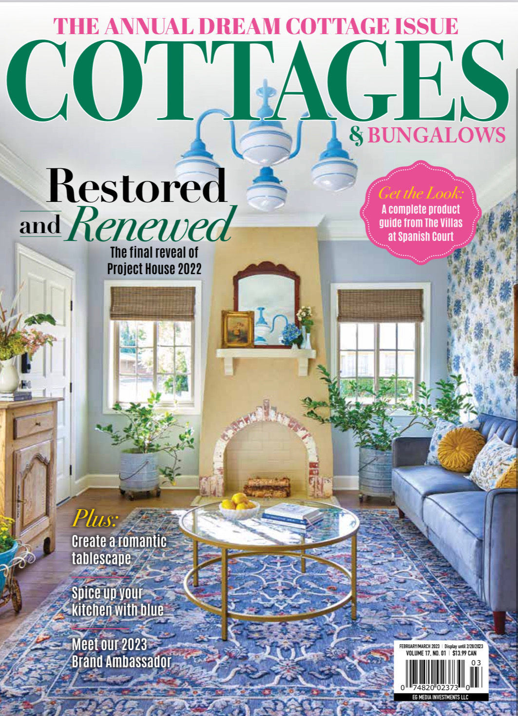
For this project, I was approached by Cottages & Bungalows and American Farmhouse Style to transform eight abandoned Spanish villas into magazine-worthy short term rentals. While it wasn’t easy, with the help of my team and several sponsors, we made the impossible POSSIBLE. My design partner for this villa was Laura Ashley. I can’t wait to take you through this renowned and restored process that made the Laura Villa come to life. The hard work we put into this project paid off. This space is featured on Cottages & Bungalow’s February 2023 cover.
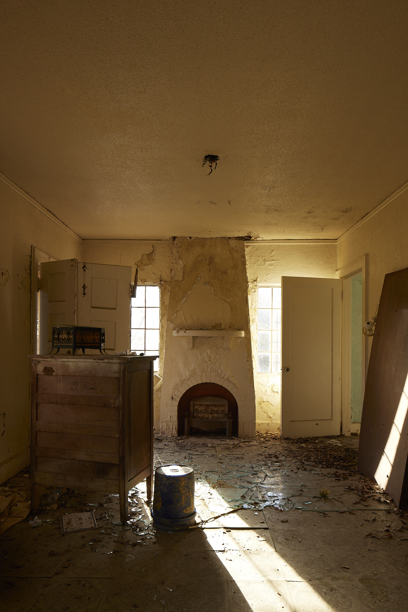
Laura Villa Baseline
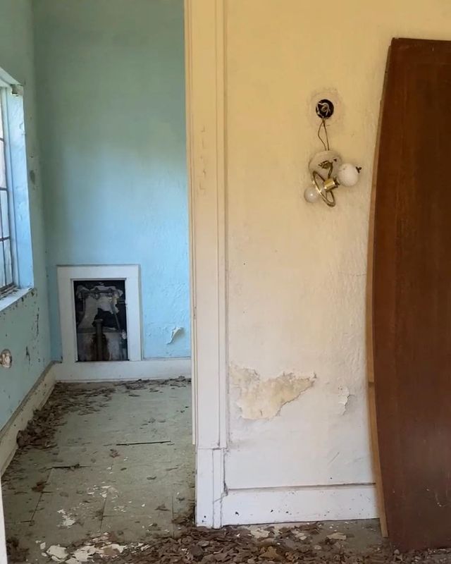
According to two former owners, these villas sat vacant and in ruins for nearly forty years. People far and wide thought they should have been torn down. As you can see, much work needed to be done to prepare this space for its moment of fame. When dealing with a restore and renew process like this, it takes a village and a firm plan to make this space. The amount of carpentry work alone that went into making these villas livable is INSANE. But combine that with measured design steps and I was able to create a magazine-worthy space. When I renovate a property, I try to keep as much as the original architectural details as possible. The layout of these beautiful villas has so much character. Creating something new from something old can embody both elements, so let’s go!

There originally was two doors going into the bedroom from the living room area. I had my team close up one door.
The Process
You might have peeped the gorgeous fireplace in the middle of the room. While definitely needing some TLC, this attractive feature was one of the main focal points. When it comes to my renovations, I love to use wallpaper in my designs because it brings back personality from the home’s glory days. If wallpaper scares you, there is always the option of papering only an accent wall to make a room pop. While darker colors and more detailed wall designs can make a room appear smaller at times, good lighting will balance it out. In this space, we have two gorgeous windows to let in absorbent natural light. Because of this, I decided on Zircon by Sherwin Williams for the walls. The fireplace needs its own moment, so upon replastering, we included Wool Skein cut by 50% to add the perfect complementing color.
The Laura Villa Magazine Cover
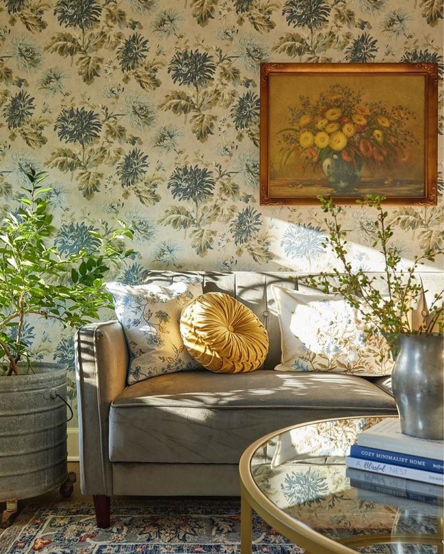
The main focal point of this room is the beautiful blue floral details that you can catch a glimpse of in almost every inch of space. Wallpaper was a no-brainer for me. I wanted to give Laura a modernized makeover but add in coastal grandmother charm. Laura Ashley was my partner on this project, and when I came across this Floral Seaspray Wallpaper, I knew it was meant for this space. I added the paper as an accent wall. The Zircon on the walls ties the room together without overwhelming other details. To keep it simple, I used Tuscan Bamboo shades on the windows. Because the windows stream in light, I did not want to overdecorate this area. Instead, I added some citrus plants to make the space feel more open and alive. I always recommend going big on plants and use REAL plants when possible. And while my citrus are housed in mop buckets (true story), I recommend these modern plant stands.
Swoon-Worthy Details
My main goal was to revive your sense of nostalgia in this space through a play of pattern, color and texture. However, you could throw a neutral sofa in here with some throw pillows, and it would still be a beautiful! But if I hadn’t chosen this dark blue couch (and it makes out into a bed!) I probably wouldn’t have been able to pull off the next part. The Turkish Rug by Laura Ashley is an eye-catcher that encompasses lots of blues and florals. However, the accents between the wall and the floor are very different, and the sofa breaks up both patterns to meet in the middle. I created a seamless design flow. I couldn’t resist adding this funky blue custom light fixture from Barn Light into the mix since we’re already having so much fun in this living area!
As a sidebar, I LOVE to look for coordinating accessories at local thrift stores and vintage markets. This vintage floral print was picked from Heavenly Treasures, one of my favorite local sources for one of a kind decor.
Laura’s Final Touches
When utilizing both bright colors and patterns, try a minimalistic approach when decorating a magazine-worthy space. For example, when choosing a coffee table to coordinate with all these colors, think traditional such as this round glass table. Glass and gold are always good elements to keep in mind when neutralizing space, or if you are unsure of what will match. Instead of searching for exquisite table decor, add a few books. Featured here, we have A Blissful Nest and Cozy Minimalist Home. Both, by no surprise, have hints of blue on the covers. I even went crazy and mixed gold and silver with this farmhouse pitcher.
On the sofa, I lucked out with more fantastic designs by Laura Ashley. These pillow covers match the wallpaper almost precisely. I can’t think of something more perfect. But, I needed more yellow to bounce off the beige the fireplace. It wasn’t much, but I added a tiny pop of texture with these gorgeous velvet cushions.
When I started working on the Laura Villa, I knew it would be a unique project. While this space obviously needed modern updates, I worked hard to bring back most of the original charm. As you create your own magazine worthy space, remember to think outside the box and find curated pieces for your room, but keep these design tips in mind. Try to coordinate colors, build upon your neutrals first, and add some greenery!
Tell me in the comments what your favorite details in this room are. Stay tuned for Part 2, when I’ll reveal how I created a magazine cover worthy space for American Farmhouse Style magazine.
PS: Reservations for The Villas at Spanish Court open soon. Keep a watch on mindenstays.com for booking info.
And special shout out to my friend Shawn Brazzell Designs from Monroe, La who helped me make sure I was all styled and ready for this shoot.
Don’t forget to shop for everything here:


You mention a dark blue sofa but all I see is a light blue sofa on the magazine cover and a tan sofa on the following picture. Also the rug on the magazine cover is not the same as your rug link. Are these two different houses?
Good morning! Links are correct. The sofa link… it’s the dark blue sofa. It looks lighter on the cover and in print due to a variety of factors like lighting, angle etc. For the rug, my color may be out of stock but let me check and I’ll circle back. ❤️
Looking for the rug too! Colors are gorgeous! Beautiful room – you did a great job! Thank you for checking on rug color!
Beautiful!!!!!
I love the mix of colors and patterns. I would be so afraid to make those choices for fearing it would look like a hot mess 🤣But when you do it, it’s lovely. I’m amazed at your “eye” for design. It’s just stunning!
I love this whole look and plan to use that wallpaper in my bedroom. I {heart} the mop buckets!
Jaw dropping beautiful! I cannot believe it’s the same place! Seriously, dreamy.
Absolutely beautiful, Sara!! God is using you real big!! 🙌🏻💖
Fabulous
Fabulous! Such amazing talent and beauty right here locally 💗
I love the room and the accent floral wallpaper. I have the exact same coffee table in my sitting room . Beautiful job.
Not only do I love wallpaper but also all of the bright and cheerful colors you use on everything the eye can see. You’re amazing. Keep up the good work> What’s next? LOL
Sara, you did a fabulous job! I love everything you’ve done I this room…love love the fireplace and I love the mop buckets! Blue is one of my favorite colors! I’m just saying it’s fantastic! Question is the chest the same one that’s in the before picture? Wish I had your vision! I’m sure the other rooms are beautiful as well…magazine worthy! God bless you 💙
Sara, you did a fabulous job! I love everything you’ve done in this room…love love the fireplace and I love the mop buckets! Blue is one of my favorite colors! Question is the chest the same one that’s in the before picture? Wish I had your vision! I’m sure the other rooms are beautiful as well…magazine worthy! God bless you 💙
Hi Rose! It’s totally different. 🙂 Thank you so much for your kind words!
I love the whole look, it is just beautiful. My favorite would be the rug and the mop buckets with the greenery.
Sara,
I can’t wait for the Villas to open. My hubby is even on board for a visit to beautiful Minden. We figured that it was five hours for the drive over. I have been following you since our friend Rhoda told me about you. Who knows maybe she might show up at some point. Many more blessings to follow you my dear. You have been faithful to The Lord during all of this. God Bless You!
I love the wallpaper❤️ It reminds me of an accent wall I papered in my bedroom in the late 70’s. I can’t wait to see what’s next. You are remarkable!
I would love that rug. Do you know what color you chose?
I believe it’s the navy one.