Creating A Magazine Worthy Space: Farmhouse Edition (Part 2)
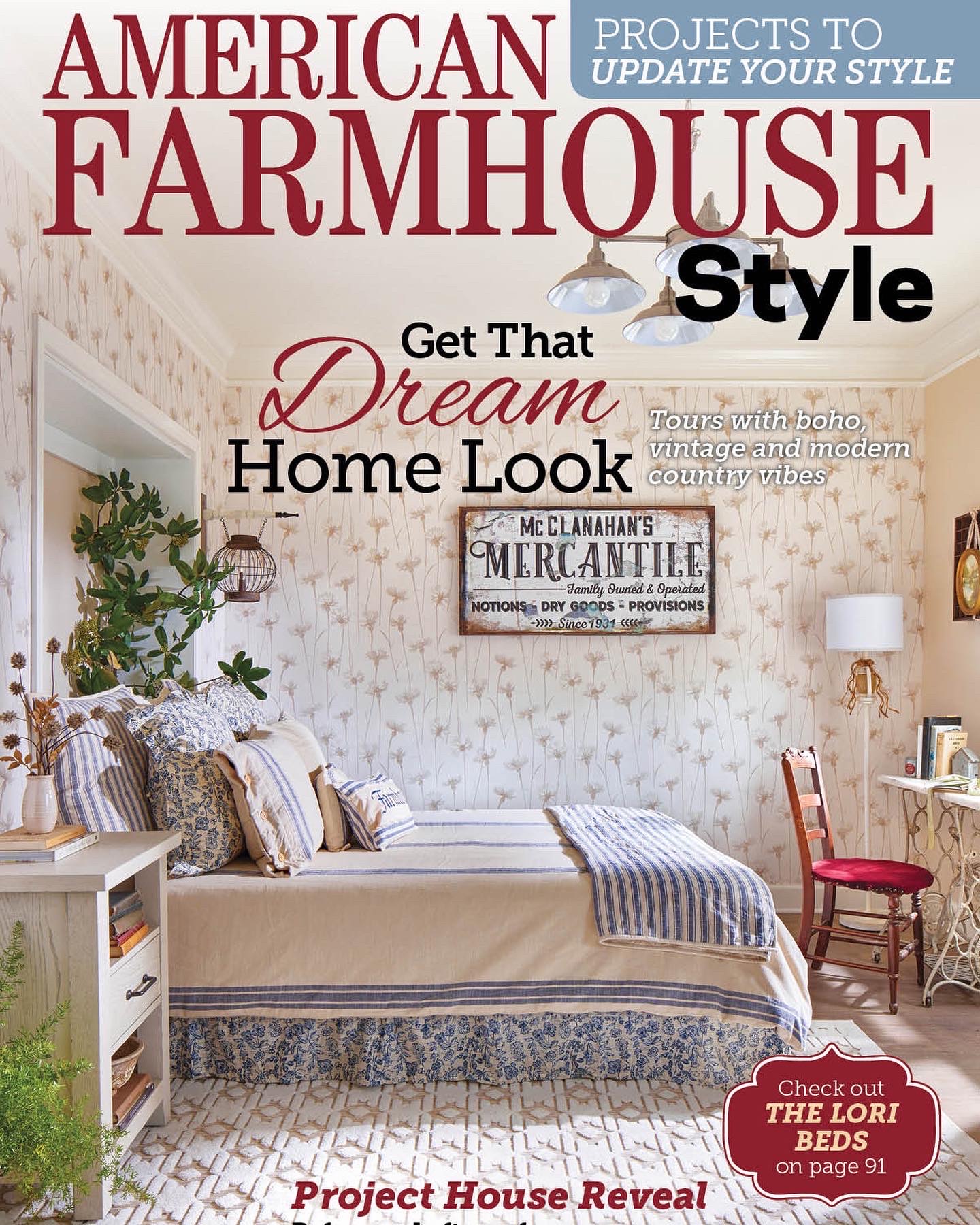
When you have a picture-perfect plan in place for a room design, it doesn’t always start off glamorous. My passion is transforming old run-down homes into magazine worthy spaces! The process isn’t easy. It’s definitely a challenging design experience but with ultimate, creative freedom. Allow me to share one of my most challenging projects and special accomplishments. Say hello to Piper, one of my Spanish villas, which was featured on the cover of American Farmhouse Style in February 2023.
The Beginning Frame
Initially, this space was far from magazine cover worthy. When dealing with a fixer-upper, it’s always essential to have a firm plan in place. Most likely, things won’t always go accordingly, but having a baseline helps tremendously. Take measurements and draw a floor plan to determine what furniture you’ll consider. Then, consider how each piece of furniture will function in your space.

In 1931, the villas were the most state of the apartments in the state of Louisiana and included Murphy beds. While the original beds were long gone, I utilized the existing hole and installed new Murphy bed.
The next step of my design process is choosing a color palette. Consider how much natural and artificial lighting you plan on incorporating. For example, darker colors and wallpapers can make a room appear smaller without proper lighting to balance it out. For Piper, I started with a neutral color base. My design plan called for farmhouse vibes, so I used lots of beiges, greens, and blues. Of course, much more planning and deconstruction happened behind the scenes, but let’s get into the fun part.
American Farmhouse Style Magazine Feature
Piper was sponsored by Piper Classics. Their decor options made this space special from head to toe. I often thrift and refurbish items from garage sales. So while some pieces are unique to this space, let’s walk through every step of this design and discuss the items. As you can see, I employed a neutral color palette but added details of complementary colors to give this room its unique charm.
Swoon-Worthy Bedding
It’s fair to say bedding is a centerpiece in a bedroom. Finding the right comforter and throw pillows can elevate your design and tie the whole room together. Keeping with the farmhouse aesthetic, this Piper Blue Striped Quilt was the obvious choice. The best part about this quilt is that it’s reversible! I incorporated the matching pillows for this setup. My fav pro-tip: the more throw pillows, the better for a magazine-worthy space. For the first pillow layer, I chose these Blue Ticking Stripe Covers, and then this Floral Gabel Design on the next. Since there are many blues, I then utilized these Cream Striped Covers to break up the flow. Pillow lineups also need a centerpiece… some smaller decor-friendly options. A few patterns are happening here, so I tied it all together with these Cream and Blue Striped Arm Pillow Covers.
I also added a throw blanket and a bed skirt. This Floral Bed Skirt is one of my favorite touches in this space. And, of course, the Blue Ticking Stripe Throw Blanket is the cherry on top. Both of these pieces have the same pattern as the pillows allowing for a picture-perfect setup.
Magazine Worthy Features
My rug collection has several beautiful designs I love incorporating into my curated spaces. The rugs range from neutral and simple options to gorgeous, colorful, detail-oriented rugs. In this space, my Minden Rug is featured in beige to keep with the neutral color scheme. The geometric details on this rug look fantastic, complementing the subtle farmhouse accents throughout the space. For the wallpaper, I desired something simple with a rustic charm to make this space pop. When in doubt, when designing any rustic/farmhouse space, floral wallpaper will almost always save the day. Bonus: this Dalia Cornflower wallpaper accents the rug here perfectly.
In an effort to incorporate all the fixings, a bedside table such as this Rustic Wood Three Drawer is another staple. Instead of adding a lamp, I styled this space with dried flowers and old books. Try and think outside the box when choosing table decor. Since the colors in this room are pretty light, I chose not to add a traditional black or brown farmhouse overhead light. Instead, I opted for this Brushed Nickel Chandelier from Westinghouse Lighting. In keeping with the theme, this light fixture blends into the room so nicely and you can barely notice its presence.
Last but not least, add greenery where ever you can! Especially when dealing with a neutral color palette, it’s easy for the room to appear dull. Adding plants will make your space feel alive and welcoming.
Farmhouse Details
You might notice the Large Mercantile Dry Goods Sign hanging on the wall. While not thrifted or vintage, it was custom created by Olive Branch Farmhouse and throws a nod to Mr. Clanahan who built the villas in 1931. The mercantile sign has the tiniest hints of blue to accent the bedding. Above the bed, I found an iron lantern and hung from this Decorative Arrow Holder. This is a tiny detail, but small touches will emphasize your design. While not pictured, I have these Blue Grain Striped curtains on the windows that match the same striped patterning on the bed.
You, too, can create a swoon-worthy magazine space, and hopefully, these small tips and tricks will inspire you. The perfect farmhouse room is within reach, and with the right furniture and decor, you’ll style a show stopping space in no time. With your own creativity and a bit of design planning, your home could also be featured in a magazine. Remember to think outside the box and find curated pieces for your room. Keep my design tips in mind.: coordinate colors, add in completing patterns and toss in some greenery! I can’t wait to see the space you create!
In the comments below, please share some of your favorite details in this room. And here’s where to find all my sources:


